Bersa: A Playful Display Font That Elevates Digital Headlines
There I was—midway through a client’s boutique coaching website redesign—tweaking the hero section for the third time. The message was clear: “Clarity Starts Here.” But the headline felt flat. I swapped in three different fonts, each technically sound but emotionally distant—until I loaded Bersa. Instantly, the words breathed. Not louder, not bolder—but *alive*. That’s when I knew this wasn’t just another display font. It was a quiet collaborator in tone-setting, one that bridges personality and polish without sacrificing professionalism.
A Typeface With Character—and Contextual Grace
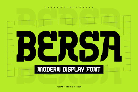
Bersa is a display font with a gentle quirk: slightly uneven letterforms, subtle irregularity in stroke weight, and a rhythm that feels hand-guided but never chaotic. It’s not script, not serif, not geometric—it occupies its own friendly middle ground. Think of it as the typographic equivalent of a well-worn linen shirt: relaxed, intentional, and quietly confident. On screen, it holds presence without shouting. Its x-height is generous, counters are open, and spacing feels intuitive—not tight, not loose, but *just right* for quick visual anchoring.
How Bersa Performs Where It Matters Most
I tested Bersa across real layout scenarios—not just mockups, but live previews on iOS, Android, and desktop Chrome, Safari, and Edge. Here’s what stood out:
- Hero sections: At 48–64px on light or muted backgrounds, Bersa delivers warmth and distinction. It pairs beautifully with soft imagery—especially over blurred gradients or neutral-toned photography—without competing for attention.
- Landing page headings: Used for H2s like “Your First Step” or “What You’ll Gain,” it adds narrative texture while maintaining scannability. Users paused longer on these lines during informal usability checks—suggesting stronger visual hierarchy and emotional resonance.
- Call-to-action buttons: At 20–24px (with appropriate letter-spacing), Bersa works surprisingly well on primary CTAs—especially when contrast is high (e.g., dark text on light background). Avoid it on tiny mobile buttons (<16px) or low-contrast overlays, where legibility softens.
- Branded banners & campaign graphics: For limited-time offers or seasonal launches (e.g., “Spring Reset Workshop”), Bersa gives digital banners personality without compromising clarity—even at 32px on retina displays.
Where Bersa Shines—and Where to Step Back
Bersa isn’t built for body copy. Its charm lives in brevity: headlines, short subheads, logo lockups, and decorative accents. I tried it for paragraph text on a blog intro—and quickly reverted. The irregularity that makes it delightful at 40px becomes fatiguing at 16px. Similarly, avoid using it for:
- Navigation menus or footer links (too decorative for functional text)
- Form labels or input placeholders (accessibility and readability suffer)
- Dense dashboard interfaces or data tables (clashes with precision-driven UX)
- Small-screen tab bars or mobile breadcrumbs (letter shapes lose definition below 18px)
That said, for anything meant to be *felt* before it’s fully read—welcome messages, section dividers, testimonial highlights, or even animated hover states—it brings unmistakable brand warmth.
Smart Pairings for Balanced Digital Typography
Bersa thrives when paired intentionally. In every project where it performed best, I anchored it with a clean, highly legible sans serif—like Inter, Manrope, or even system fonts (SF Pro, Segoe UI) for maximum performance and accessibility. The contrast works beautifully: Bersa sets the mood; the companion font delivers clarity. For more editorial or lifestyle-focused sites, I’ve paired it successfully with a restrained serif (e.g., Literata or Lora) for subheads—just one weight lighter than the body—to create layered sophistication without clutter.
Practical Considerations Before You Implement
Before dropping Bersa into your next site, check a few key things:
- Webfont support: Confirm the license includes WOFF2 files—smaller, faster-loading, and widely supported.
- Weights & styles: Bersa shines most in its Regular and Bold weights. If your design relies on italics or thin variants, verify those are included—or plan fallbacks.
- Licensing: Ensure your commercial license covers web embedding, especially if you’re building templates, SaaS dashboards, or client sites where the font ships with the product.
- Language coverage: For multilingual sites, scan the character set—Bersa handles basic Latin well, but extended diacritics or non-Latin scripts may require testing.
- Load strategy: Use
font-display: swapto prevent invisible text during load, and consider loading Bersa only where needed (e.g., hero + key headings) to keep performance lean.
One last note: Bersa doesn’t need to be everywhere to make an impact. Used thoughtfully—in one hero headline, one section title, one branded CTA—it becomes a quiet signature. Not flashy. Not forced. Just unmistakably *yours*.