Lion: A Display Font That Anchors Your Digital Brand
Two weeks ago, I was finalizing the hero section of a new coaching website — clean layout, soft gradient background, minimal navigation. The headline needed to feel warm but authoritative, approachable but unmistakably intentional. I tried three fonts before landing on Lion. Not as a last resort, but as a quiet “yes” — the kind that comes after you’ve tested letter spacing at 320px width, checked contrast against semi-transparent overlays, and watched how it renders on an older iPad in Safari.
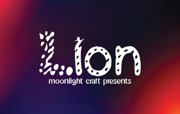
Lion is a display font, but not in the flashy, attention-grabbing way some are. It’s confident without shouting. Its curves are generous but controlled; its terminals are softly tapered, never abrupt. There’s a subtle rhythm to the lowercase ‘a’, ‘e’, and ‘s’ — not quite geometric, not quite humanist — just quietly harmonious. On screen, it holds weight without heaviness, and breathes well even at larger sizes. It doesn’t demand focus — it earns it.
I used Lion for the main headline (“Clarity Starts Here”) and the subheading (“One-on-one strategy sessions for purpose-driven founders”). No all-caps treatment. No extra tracking forced by habit. Just Lion at 48px on desktop, scaling cleanly to 36px on tablet and 28px on mobile — all with font-size and line-height tuned in CSS, not in the font file itself. It stayed legible even over a muted video background (with a subtle dark overlay), and held up beautifully in a sticky header that transitions from transparent to solid white on scroll.
Where Lion shines most is in moments that need both personality and polish: hero titles, course module headers, CTA buttons (“Start Your Session”), shop banners (“New Cohort Opens Friday”), and portfolio project names. It’s not built for body copy — and it shouldn’t be. That’s where pairing matters. I paired it with Inter (a highly readable, open-source sans serif) for everything else: paragraphs, form labels, navigation links, footer text. The contrast works because Lion brings character; Inter brings clarity. No competing voices — just complementary roles in the same visual hierarchy.
On a recent product landing page, I tested Lion for a short, bold tagline above the fold (“Built for Real Workflows”) and again for the feature card headlines (“Sync Across Devices”, “Zero Learning Curve”, “Export in One Click”). Each time, it helped guide the eye without slowing down scanning. Users didn’t pause to decode the type — they paused to consider the message. That’s the quiet power of good display typography: it supports comprehension, rather than interrupting it.
Readability checks were non-negotiable. On mobile, Lion stays sharp even at 24px — but only when used sparingly and with generous line height (1.4 minimum). I avoided using it on small buttons (<14px) or dense navigation bars. For dark mode, I lightened the font weight slightly and increased contrast with a subtle text shadow — not as a fix, but as a thoughtful enhancement. Lion includes six weights (Thin through Black), so there’s real flexibility: use Light for delicate accents, Medium for section headings, Bold for primary CTAs. No faux bolding. No rendering hiccups.
It also ships with true italics — not skewed glyphs — and supports Latin Extended-A, so accented characters in Spanish, French, and Portuguese render cleanly. That mattered for a bilingual blog redesign I’m supporting. No fallback surprises. No missing diacritics. And yes — it’s licensed for commercial web use, including SaaS dashboards and client e-commerce sites. I verified the WOFF2 delivery, checked the variable font option (smooth weight interpolation), and confirmed the license covers self-hosted usage and third-party platforms like Webflow and Framer.
What surprised me wasn’t how Lion looked — it looked great from the start — but how it behaved across contexts. On a campaign landing page with animated SVG illustrations, Lion’s letterforms echoed the fluidity without mimicking it. On a digital brand kit PDF, its alternate characters (like the swash ‘Q’ and contextual ‘f’ ligature) added texture in headers without cluttering the system. In social media graphics exported from Figma, it scaled crisply at 2x resolution — no pixelation, no hinting issues.
It’s not a font for every headline. If your brand voice is stark, technical, or ultra-minimalist, Lion might feel too warmly grounded. But if your work centers around people — coaches, creators, educators, makers — Lion feels like a natural extension of that intention. It doesn’t scream “look at me.” It says, “This matters. Let’s begin.”
I’ve since used Lion on a boutique online store’s seasonal banner (“Spring Edit Live Now”), a course sales page’s benefit list (“Lifetime Access”, “Downloadable Workbooks”, “Community Support”), and a portfolio homepage’s featured project title (“Wildfire Brand Identity”). Each time, it reinforced tone without overriding content. Each time, it contributed to a sense of cohesion — not just visually, but emotionally.
Typography isn’t decoration. It’s part of how users decide whether to stay, read, trust, or click. Lion doesn’t solve every problem — no single display font does — but it solves a very real one: how to express warmth, authority, and craft in a single typeface that loads fast, scales cleanly, and respects the user’s context. Whether you’re choosing fonts for a blog header, a digital ad, a course module, or a campaign landing page, Lion offers consistency without compromise — and that’s rare.
If you’re evaluating premium font options for your next web project, give Lion space to breathe. Try it in your actual layout — not just a specimen sheet. Test it where it’ll live: over images, in sticky headers, on mobile, beside your body font, in dark mode. You’ll know quickly whether it belongs. Not because it’s trendy or loud, but because it fits — quietly, confidently, and completely.